How to Design a Retail Booth for Maximum Impact
Have a retail space or looking to get one? These are five key rules for how to design a retail booth for maximum impact.
It’s not enough to have beautiful products if they aren’t displayed well. It’s the same as staging to take product photos. Your booth is your stage and there are ways you can make it shine.
I’m sharing with you not only my own booth space at Homemade at The Barn but also four other displays. These are some of the best examples of how to design a booth for maximum impact.
With around 100 traders at The Barn, I’ve narrowed the tips down to those that will make the biggest difference to a retail space.
How to Design a Retail Booth for Maximum Impact
1. Make the Most of the Height
Tallulah Vintage Home is a vintage and upcycled retailer who does a brilliant job of maximising the height in their booth.
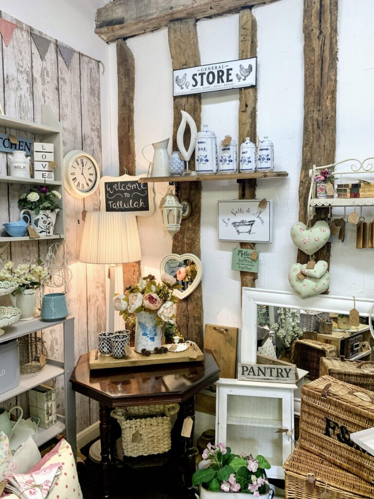
It’s not enough to just place products at the customer’s eye height. That limits the products you can display but is also visually uninteresting.
What Tallulah Vintage Home does so well is place items from the floor to way above head height. This builds a display that keeps the eye moving and always able to see something new and interesting.
2. Have a Consistent Style
Coconuts for you creates sustainable alternatives to plastic.
This display is an example of having products that complement each other to create a consistent style.
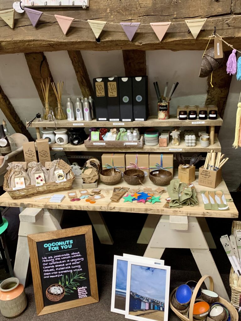
Many of their items are natural materials such as coconut and bamboo. Right down to the choice of wooden table and sign, the booth instantly gives the impression of environmental consciousness.
Importantly, as could be a risk with a lot of browns, it isn’t boring. There are splashes of colour in the labels, ribbons and flowers which add variation to the natural tones.
It doesn’t matter if your style is neon, leopard print or vintage. By making the pieces work together, customers can better understand your style and decide whether it suits their own.
3. Stage pieces so customers can picture them in their home
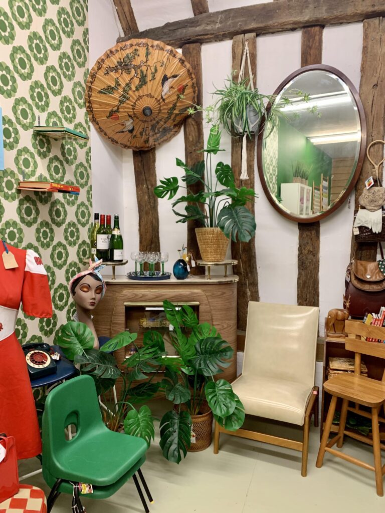
MamaRumbas sell handpicked vintage and retro decor and clothing.
They excel at creating displays that help customers picture the pieces in their own homes.
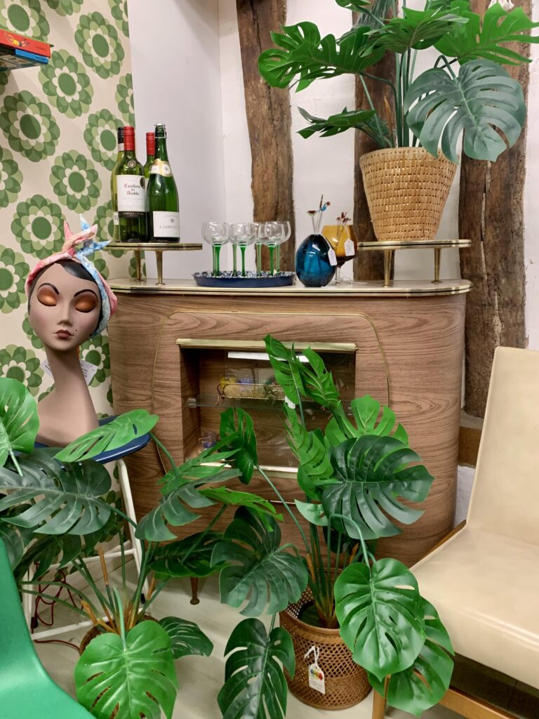
Not only do they have a consistent style of vintage and retro pieces but they place them together in a natural setting.
The bar is styled with bottles, glasses and plants, all things that would go with the piece in real life.
Customers know how much space there is for their own items because of the relevant staging. Sometimes they will buy even more pieces from the display because they like the overall look.
4. Create a multi-layered display
Hetty’s Chalk Room creates layers with their pieces to maximise their display space.
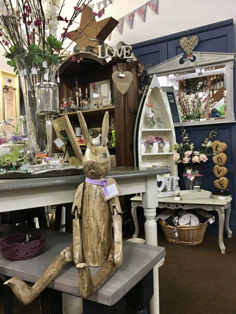
Instead of having objects placed next to each other in a row, it’s better to layer them up with smaller items on top. By making the biggest piece the base, you can feature additional products, creating a more varied and visually interesting display.
Here, there’s a bench underneath a table, both of which have pieces on them. Also, there’s a table with a basket underneath it in the background. This makes the most of every available space without being crowded.
5. Enhance the space you have
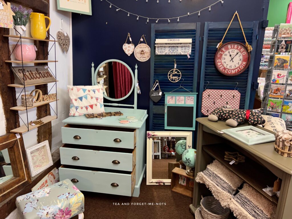
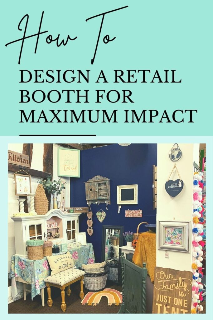
Add paint, dividing walls or wallpaper to give the space more impact. This example is from my own booth, Tea and Forget-me-nots.
You may take over a plain white space that you’d like to jazz up. Or it could be a large area that looks bare with furniture just around the edge. There are lots of semi-permanent options to add character and interest.
The space I moved into…
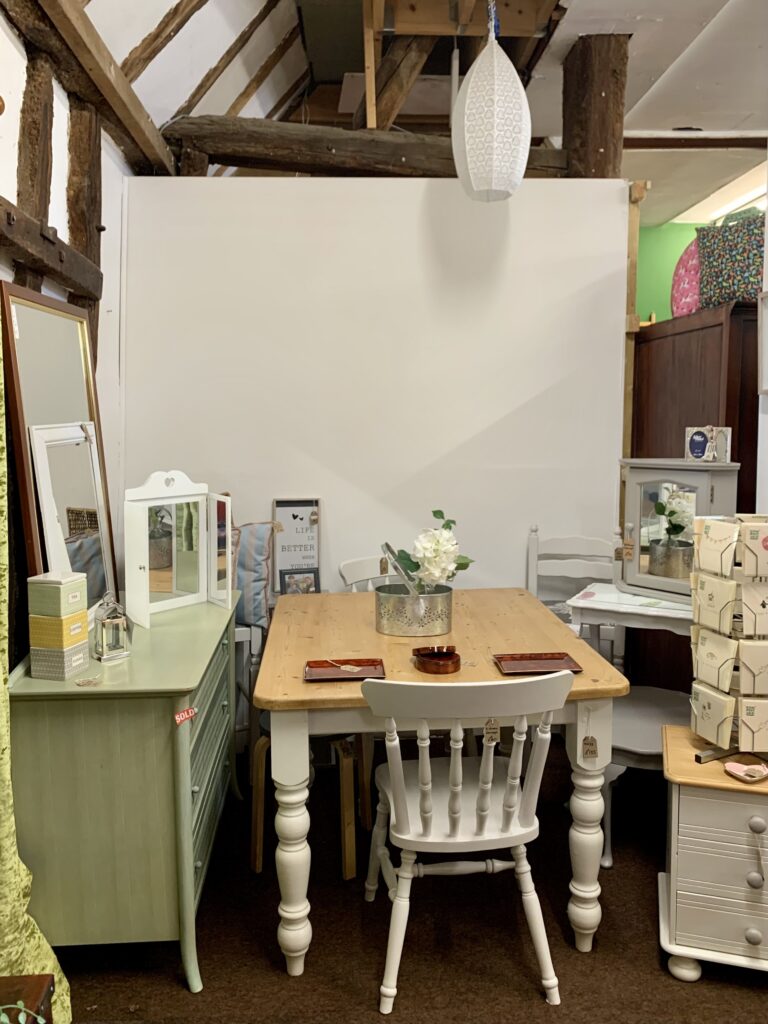
I had a blank canvas when I moved downstairs at The Barn. So, to make the pieces stand out better, I painted the wall a complementary navy colour.
Want to know 23 great DIY tools? Get the list!
Tallulah Vintage Home has wood-effect wallpaper in their booth which matches the rustic, homely style of their pieces.

MamaRumbas has retro wallpaper on one of their walls to complement their style.
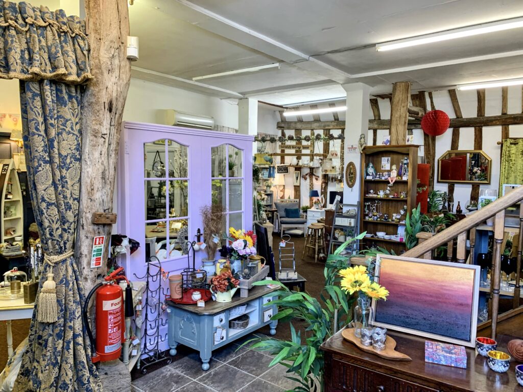
Hetty’s Chalk Room cleverly uses doors to frame their walls and divide up the large space into sections. This creates a path through the area so pieces don’t feel like they’re floating in the middle.
All of these ideas are simple to do and can easily be undone when leaving a booth space. Depending on what feel you’re aiming for, think about the colours, textures and physical assets that will enhance your style and maximise the space.
With thanks to Tallulah Vintage Home, Coconuts for you, MamaRumbas and Hetty’s Chalk Room for kindly allowing me to share their spaces with you.
Do you have your own retail space? Have you followed these design tips or have any others to share? Let me know in the comments below.
Did you enjoy this post? You might like more tips!
Pin it for later – How to Design a Retail Booth
Head over to my YouTube channel…
Hi there! I'm Rachel Bowyer, a passionate DIY enthusiast with a knack for transforming the old into something beautifully new. With a deep love for furniture painting, refinishing, and the art of crafting. I've been documenting my DIY projects and restoration journey since 2018. I specialise in techniques like decoupage, stencilling, and decor transfers. Join me as we explore the world of creativity and home improvement, one project at a time.


I feel like these are great tips for decorating your home too!
Great point!
Visuals really do make a difference to a successful sale!